The Very Basics of Graphic Design
I'm an engineer. The extent of my formal arts training was Art and Design 101 (which did have "studio" section mind you). To characterize me as anything beyond someone that knows just enough to do be dangerous would be a gross exaggeration. That said, let me tell you how it's done.
As a researcher in the IRKM lab, there are two situations when you'll have to don the graphic designer hat: when you're designing a webpage or a user interface, and when you're making a research poster. This tutorial focuses on designing a poster, but the principles are common enough to be applied to most any visual medium.
Graphic design is an art, but it's also a science. Since I don't have any real knowledge to give, I'll share the one trick I have: The Grid. Designers have been using, in one for or another, grid layout for centuries, but it wasn't until the 1920's when the Swiss perfected it. The Grid is perhaps the most elementary tool of any modern page layout, but there's enough to it that entire books, and countless webpages have been devoted to the subject.
The Grid is exactly what it sounds like. The canvas (i.e. page, poster, whatever) is divided into regular sized pieces. While the grid does not need to consist of only regularly spaced squares, the sections do need to be at regular proportions. Whether you make each cell a a multiple of 1/16 or 1/3, it doesn't so much matter. Pick a useful size, and go with it. By using a grid, you ensure that elements remain properly aligned and balanced. Size all of your elements to an integer number of cells, and your layout will automagically not completely suck.
The other advice I have aren't tricks, but more of just reminders. First off, watch your colors. Make sure you have nice contrast between your text and background. If you want a background color or image for you poster, make sure that it's light. When printing a dark background, the ink could saturate the paper can cause the paper to pucker. From a practical perspective, most graphics are designed for a light background. The colors tend to be dark, and transparent areas tend to be intended to be white. or at least light. If you want to use images on a dark background, be prepared to heavily modify your graphics to ensure adequate contrast. The other reminder is not to use clip art. First clip art looks cheap. It looks dated. It's kitsch. From just a practical perspective, clip art tends to be aliased low resolution, and so it won't print properly on a poster. In short, look at any random page on MySpace? , and do the exact opposite.
Well enough talk, let's dissect some example posters.
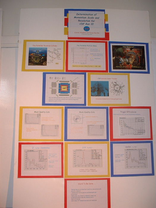
This example from WPI is your typical research poster. Six blocks. Some decent graphics. It gives the general vibe of a university template, which makes it pretty pedestrian. There's nothing wrong with this poster. It's perfectly acceptable, but there's nothing outstanding about it either. If you end up making a poster that looks like this, you have nothing to be ashamed of. You'll be in good company.
This UW poster isn't perfect, but it's still pretty good. First, it's unique, and that will cause people to notice it. The background distinct, lightly colored, and well composed. The graphics mirror the color pallet of the poster of the whole, which contributes to a sense of consistency. However, the poster isn't perfect. First, it's a bit text heavy, but it's not bad. Secondly, as a matter of preference, I prefer full justified text. It seems cleaner. The big problem with the text justification isn't that it's ragged right, it's that it isn't consistent. The "Next Steps" and "References" sections are full justified, while the rest of the poster is ragged right. There's no excuse for that. Pick a justification, and use it everywhere. The third thing that's wrong with it is, is the lack of alignment in the third column. The designed attempted to "break the grid" (which is an acceptable technique, if used properly), but the main graphic causes the "Design Goals" and the "Solution" sections to break alignment. If the main graphic was lower down, then the blocks would still look in proportion to the others, but as it is, the "Design Goals" block looks like it's been given the short shrift.
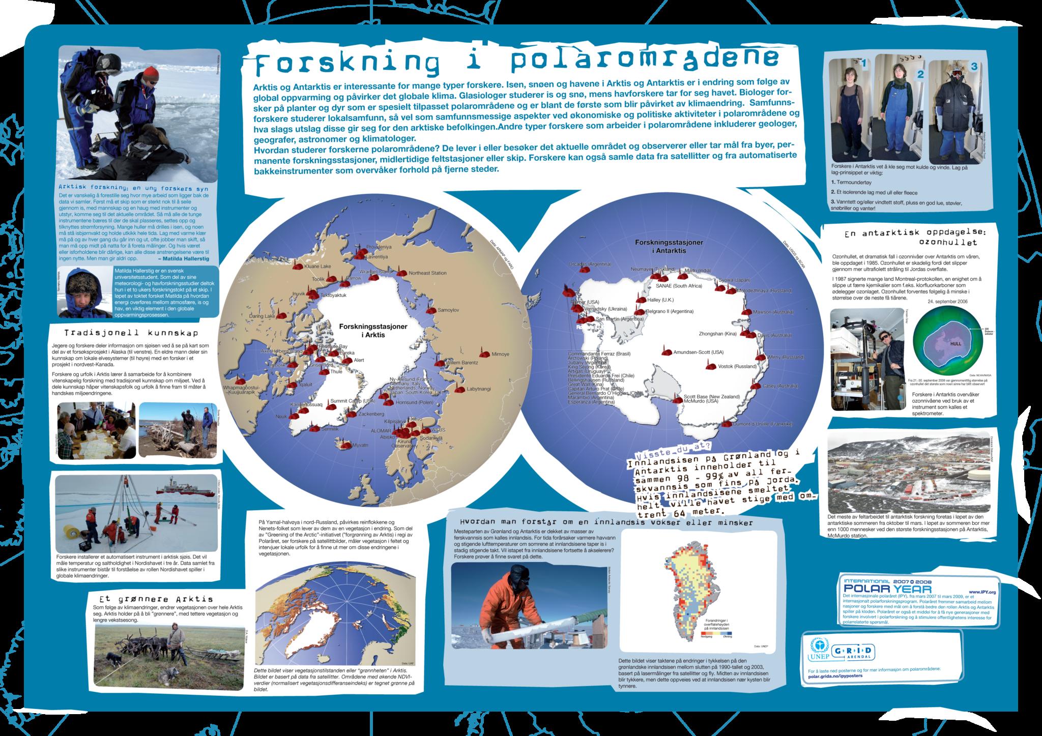
This Norwegian poster is nice. It has nice background. There's very clover dual theme going on. First, the blocks look like ice, which is great given that the research is about polar ice thickness. The second theme is that by giving each block a title a grungy typewriter font, the poster echos old dispatches from the polar exhibitions from the beginning of the 20th century. One thing this poster has going for it, that computer scientists just don't have, is there's lots of photos. Not just any photos, but photos of people looking cool, while doing cool things, in a cool place. *sigh* It's just great.
This computer science poster is quite good. There's no part of this poster that isn't used to it's full capacity. The top bar not only contains the title, but explains the tile, and gives a very quick problem statement. Color breaks denotes the explanatory blocks. The graphics are clean, and easy to reproduce. The silhouettes of people invoke why users would use the described technology. Also if you're paying attention, you can see the tale tell signs of a design grid. The left block of the "Web + Photo Journal" section aligns with the left block of the "Syntehsis + Analysis" section. The right block of the "Web" section spans the right most columns of the "Synthesis" section. The "Interviews" section is proper aligned with the problem description, and the "Review" section is nicely aligned with the title. Also notice how the bottom graphic isn't just a throwaway image, but actually contains the project's timeline. My main complaint about the poster is that isn't clear who performed the work. The name is hidden away in a small text at the very bottom of the poster. It looks like a legal disclaimer. You did the work. Be proud of it.
Finally, let's talk about some counter examples. This is not a poster. It's a bunch of PowerPoint? slides printed up and scotched taped to a wall. A poster is a single sheet. This is an attempt to crawl across the line and do the absolute minimum required. The sad thing is, this non-poster is bit more involved than most non-posters. Most people pulling this stunt, don't even bother with the construction paper backgrounds. The only place where a motley assemblage of plain paper printouts can masquerade as a research poster is a science fair held in a junior gymnasium. Displaying something like this tells the audience that you don't care about your work, and if you don't care, why should anyone else. There will be at least two authors making a display that looks like this. Don't be one of them.
Alas, the junior high science fair isn't the worst poster imaginable. No, the absolute worst poster is simply printing your poster paper as a four foot high wall of text. You will see at least one of these every year. There's simply no excuse for this. Anyone who shows up with this, is either incredibly stupid, or incredibly lazy. A simple Google search for "research poster" or asking anyone if they've even seen a research poster before would have prevented this. If PowerPoint? slides is Poster Fail, then printing up your poster paper as a 48 inch x 36 inch wall of text is an EPIC FAIL.
-- Main.Jonathan - 22 Apr 2009
| Attachment | Size |
|---|---|
| 497.54 KB | |
| 61.13 KB | |
| 1.39 MB | |
| 563.53 KB | |
| 1.32 MB |